Workday Or
g Studio
Redefining organisational design tools from the ground up.
Org Studio - A Drag and Drop tool for doing re-orgs
Background
A tool for Organisation Design
Workday provides a suite of Human Capital Management products that allow companies to manage and organize their workforce more effectively. Org Studio, a new product in the HCM suite takes the traditional Organisation chart (or ‘org chart’) and adds self-service functionality. Org Studio provided business users like managers, HR, and executives a tool to visualize, execute, and collaborate on reorganisation projects within Workday saving huge amounts of time and cutting down on a very manual process, all without requiring any training manual.
The vast majority of Workday’s users are familiar with it’s form based interfaces necessitated by the system’s metadata driven UI. The work we did on Org studio contributed to a brand new experience paradigm, Workday’s first drag and drop experience. The components and patters created for Org Studio are now baked into the Canvas design system and re-used throughout the entire workday product ecosystem. The diagramming model was also used to create an entirely new diagramming service for Workday, reused for products as diverse as supply chain and financial management.
My Involvement
Concept, I.A, Product Design, Pattern Documentation
Research (collaboration)
Defined design program, approach and strategy for a brand new product.
Stakeholder, Customer and PM collaboration
Challenges
Team located in 3 countries
Development team unfamiliar with UX
Constant requirement changes
MVP vs. MLP
Before: The Business context
Workday’s Org Chart is one of the most popular parts of Workday with over 350,000 unique users accessing it every day. Customers love this. It’s a great tool for visualising hierarchy as it pertains to a users immediate team, but its function is really limited by a static viewport (no zoom or scroll) and read-only functionality.
Workday’s popular ‘Org chart’
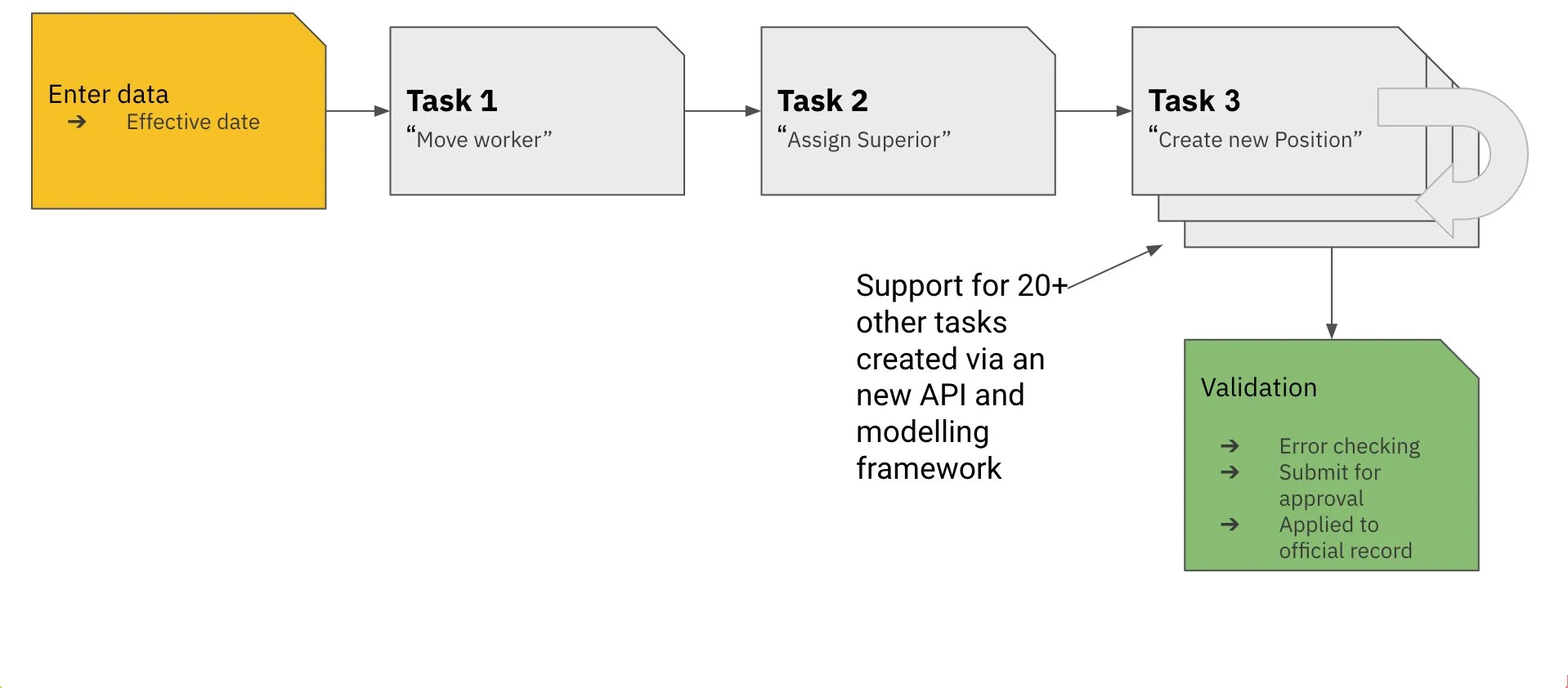
‘Re-org’ projects typically involve lots of separate tasks taking place to finish ‘the job’, before Org Studio this meant many users (who were already time poor) were being forced into a repetitive cycle of searching for a task ie: ‘Move worker’ entering the relevant data for the move and then submitting this single task for validation. It was a metadata based model that prioritises a system performance and scalability over the mental model of the user.
Rethinking a cumbersome task flow.
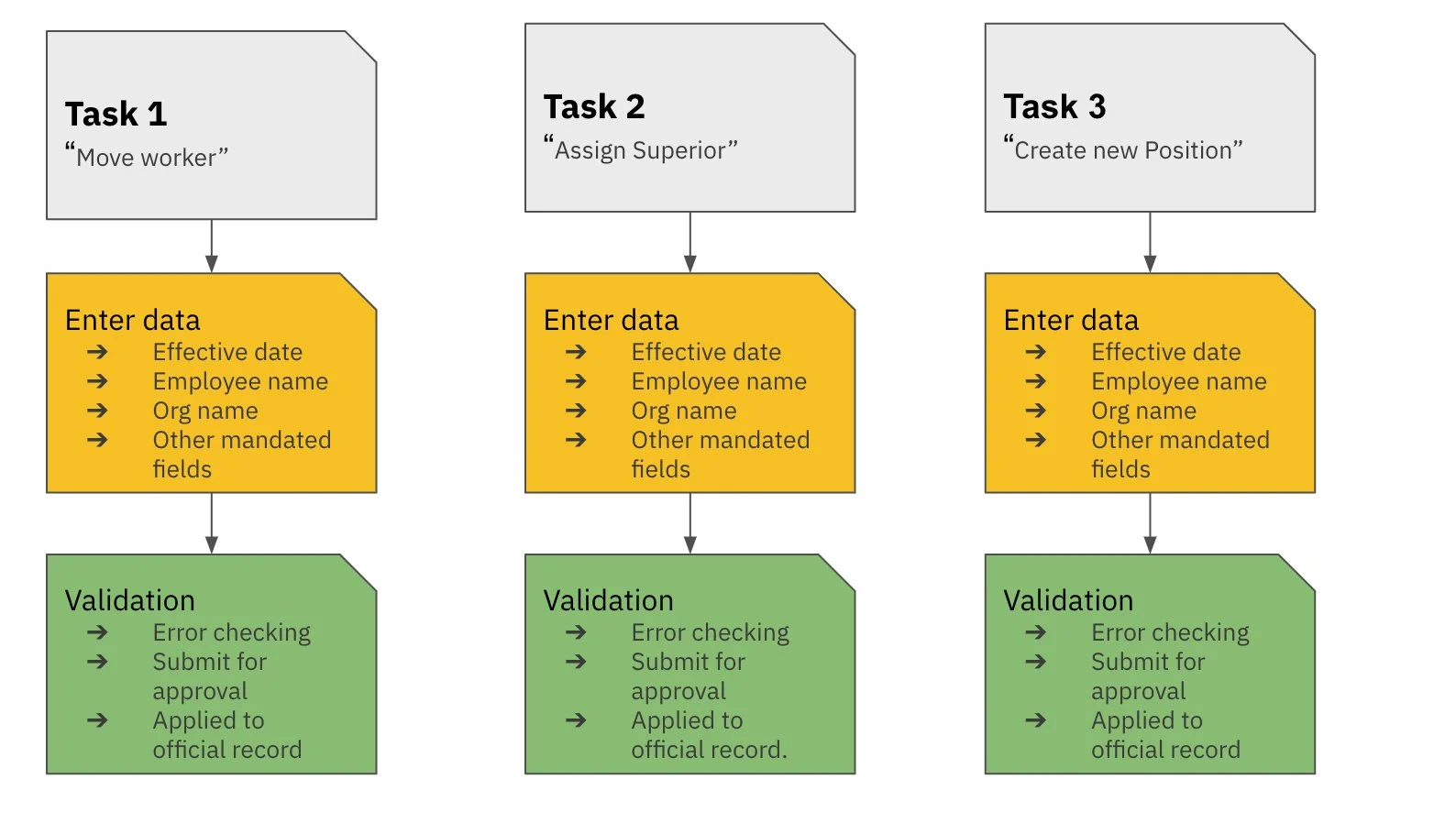
A typical chain of tasks in a reorganisation project for Workday users (normally H.R Business Partners)
A metadata model of task execution
The user was forced to Search for individual task ‘prompts’ before adding details and submitting for approval one by one ie:
“Move worker”
“Assign Superior”
“Create Position”
“Inactivate org”
An example of an old form required to complete a single task - ‘move workers’
Process
Starting with user research was the only way to understand what to build.

1:1 On-site Interviews, 40 Participants, 60 min sessions
What did we want to achieve through research?
Get a better understanding of the users context. To find out what is important to the user.
Clearer understanding of the org modelling process during a reorganisation projects.
Identify the key tasks each user was trying to accomplish and the type of information they need most to complete those tasks.
Evaluate the prototype/concept and scenario we presented.
What we learned
1.
Current Workday tools for organisations to model, visualise, and execute reorganisation projects happen on bespoke or home-brew tools (powerpoint, excel, and vizio)
2.
In order to use workarounds customers were exporting data out of workday, creating large scale security, operational and legislative compliance challenges.
3.
Large customers are in a constant state of reorganization, and are searching for ways to sharpen an incredibly manual process that’s bogged down in approvals, and communication overhead.
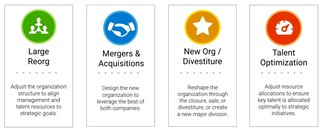
Key use cases we discovered
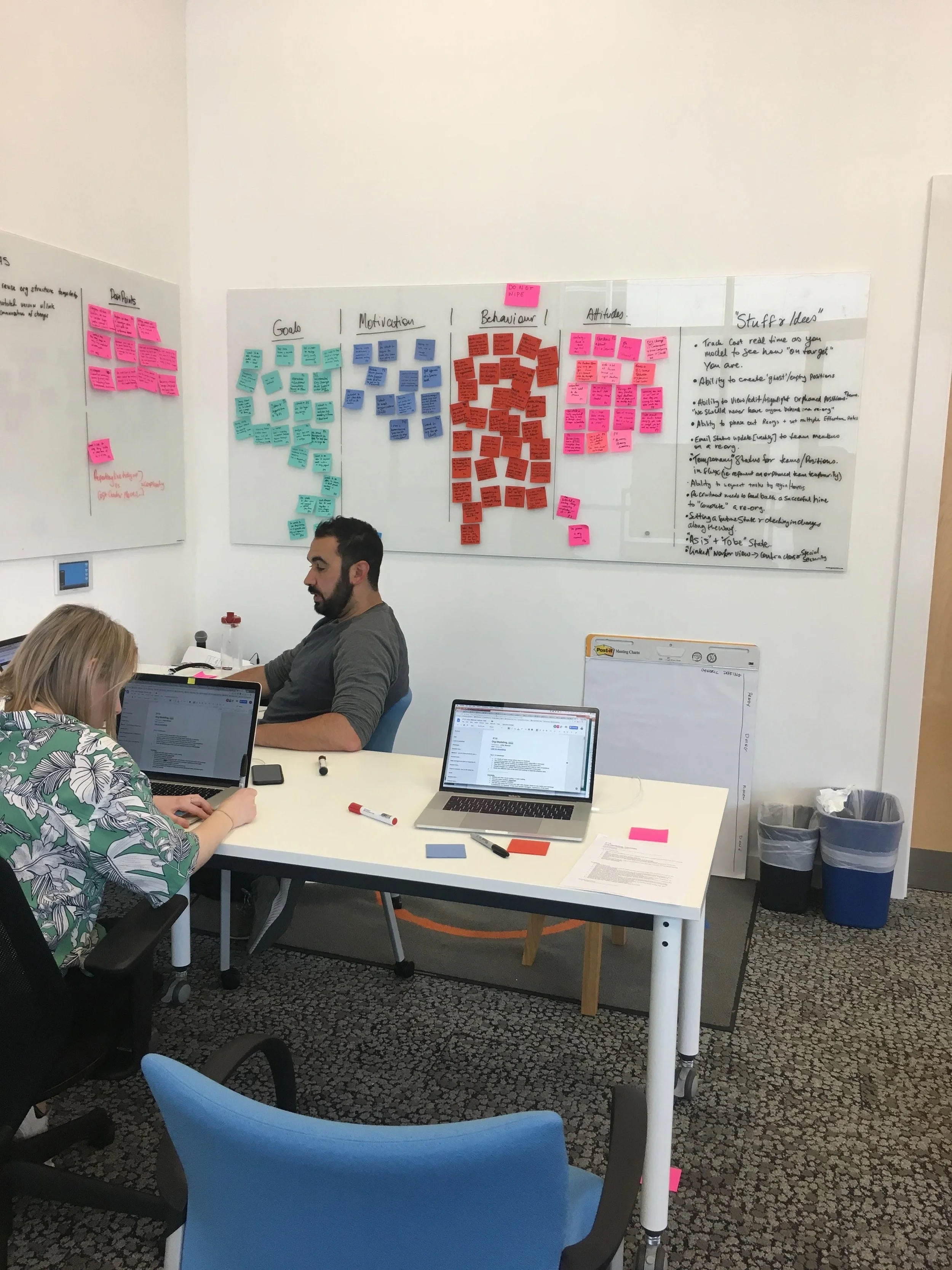
Working with the team to synthesise user interviews and create personas - May 2018
Two primary personas
Key findings from research
All four of these key themes helped shape the direction of the product showing us challenges we needed to design for.
Communication
Communication during reorganisation projects is critical to the success; Business Leaders and HR Business Partners use org charts to tell a story.
Which meant:
Baking in communication and collaboration into the tool - we integrated the product with existing messaging tools and ensured it worked seamlessly with livepages (workday’s version of google slides /keynote)

Hierarchical Connectivity and Complexity
Users struggle to deal with the complexities they have to take into consideration in order to complete reorganisation projects with complex hierarchical and functional connections.
Which meant:
Content auditing old UI labelling and collaboration with the content strategy team.
Designing clear onboarding, making interaction so simple and intuitive no instruction manual was needed for first time users (a workday first).

Collaboration
Large scale organizational design projects happen across many different teams within a company.
Which meant:
Surfacing event history clearly via a timeline, showing which users had made edits and enabled versioning.
Integration with Workday’s role based security to add participants and groups to a project.

Showing Data in Context
The information within the system at the people level should augment decision making and support team building.
Which meant:
Integration with Workday’s Business Intelligence framework.
Designing a dedicated space for users to review analytics about their reorganisation projects.
Designing a Completely New Flow
After working closely we the development team on the capabilities of the API’s we came up with a flow that more closely matches our users way of working.
Some (very) early sketches

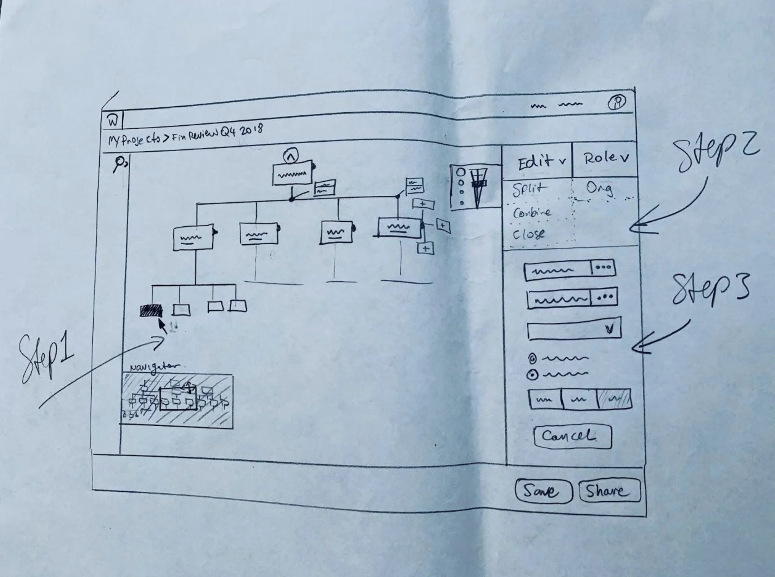
An early sketch of the side panel (open when a node is selected) as well as zoom controls and minimap

Drag + Drop.
We heard from users they didn’t want to have to read an instruction manual to use the tool. Radically simplifying their flow to reflect the way they worked meant designing an intuitive drag and drop interface.
Animation of multiselect to single select + roll over to describe interaction more clearly to the development team
A concept for directional drag and drop controls that helps to show the direction the user is dragging.
Drag + Drop States
A selection fo drag and drop states created in collaboration with Canvas (design systems)
Our first iteration in browser, we took this to user testing to see what users thought.
Overall Feedback on Concepts
When we presented the prototype most participants were very excited with the direction we were heading. Many stating this would be a game changer for their organization and make their lives much easier.
"This is one of the biggest developments that Workday can do. This is all about business connectivity. Executives would say this is a huge value add. In terms of designing an organization, this is incredibly powerful."
- HR Director
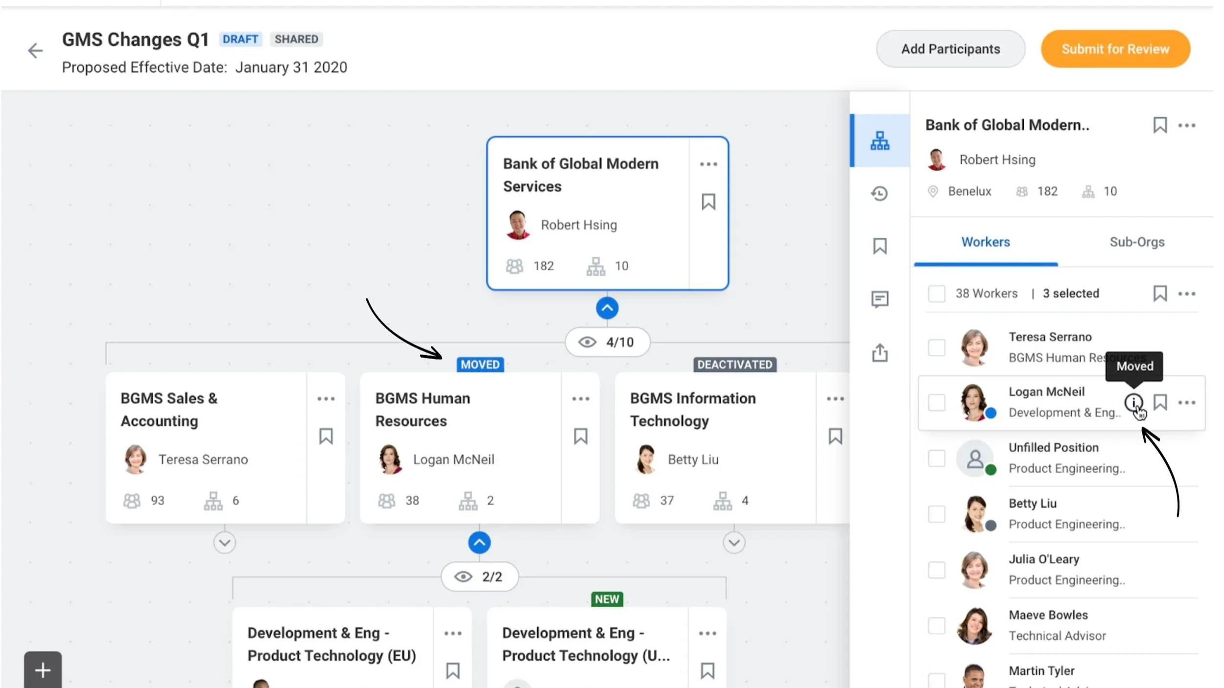
Users needed to be aware of differences between existing data and proposed changes.
Displaying Status
Workday takes a snapshot of live data to create an instance of the current org chart data allowing users to edit without making changes to the companies structure. In user testing we found we needed a way to make it much clearer to users they were not actually editing live data ( a scary prospect indeed), so making sure users knew what has changed in their current ‘design’ vs. what the ‘as is’ was crucial. This meant designing status tags (colour co-ordinated to match high level design system guidance) both on the nodes themselves and in the side panel where we brought in small coloured chips as indicators beside workers or sub-orgs who had been changed.
Form and Behaviour specification
Information breakpoints
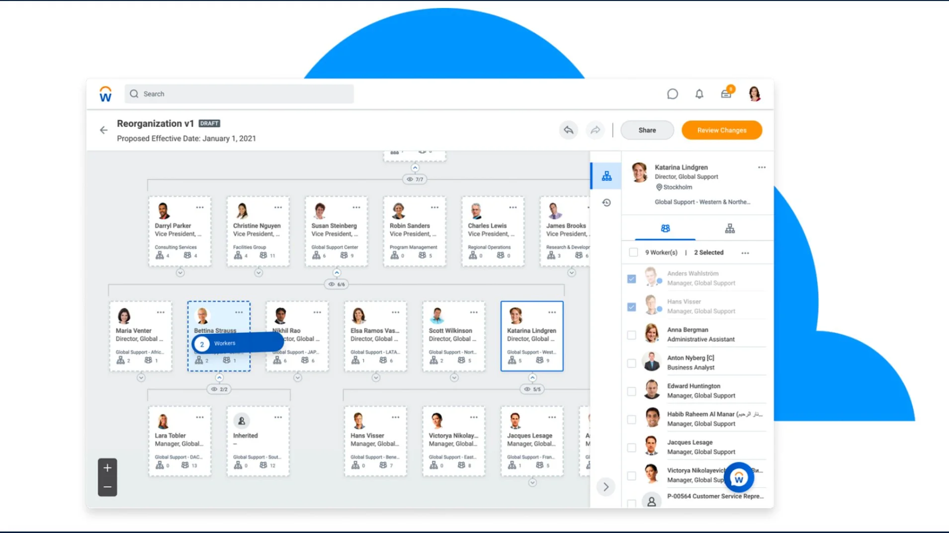
Users have both a need to view the org chart at a high level and a more granular view. Zooming in will reveal more detail on each node, whilst zooming out will reveal less. To provide the user with an appropriate level of detail at all zoom levels I created responsive ‘cards’ with responsive breakpoints in four key sizes.

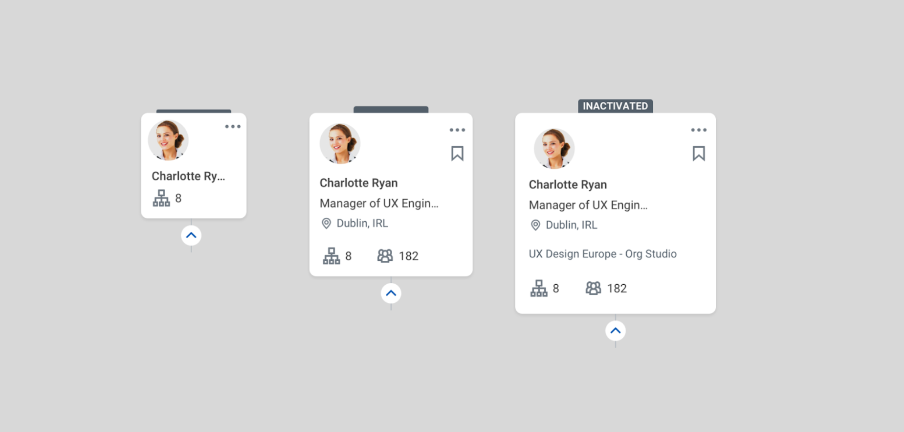
Org Chart Anatomy
Creating a completely new tool meant documenting our approach to diagramming for development, and fellow designers onboarding onto the tool as well as leaving a detailed record of decisions made. (click the image to view details)
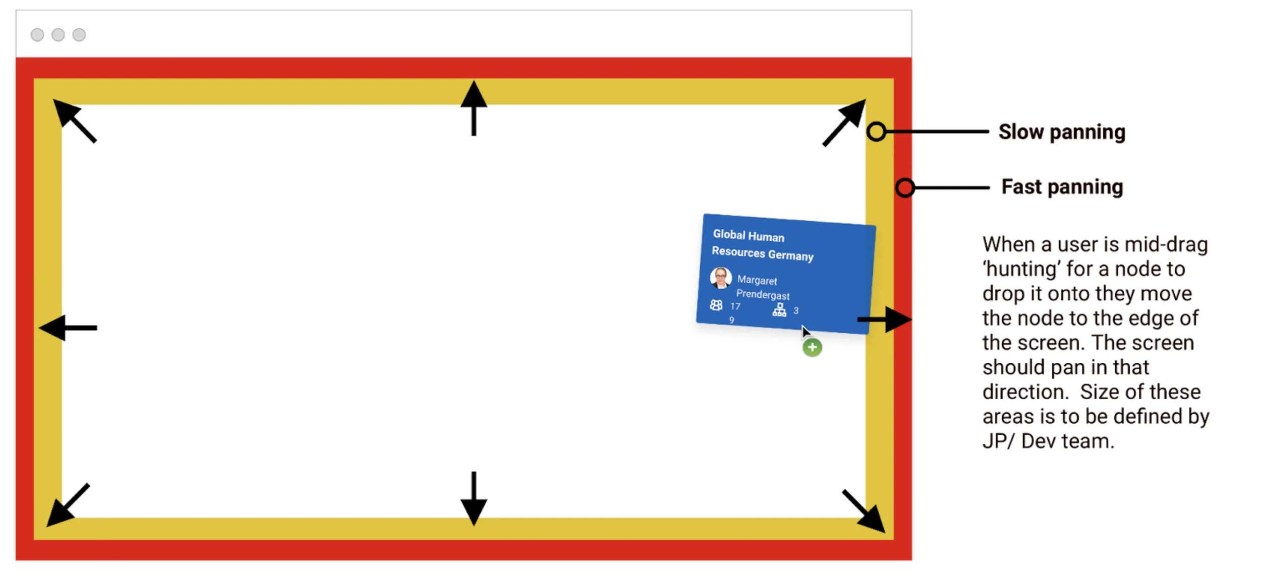
We also had to document some fairly particular characteristics of a drag and drop interface as it was built from scratch, below an image I used to describe panning acceleration with our development team in Munich, we had to code /design these small interactions from scratch.
A demo of the ‘final’ product released to customers
Best viewed fullscreen at 1080p